Most guys settle into the same rotation without thinking about it: black jeans, a gray crewneck, white sneakers, maybe a navy blazer for anything that calls for effort. It’s a safe uniform, and it rarely goes wrong — but it also doesn’t say much. The reason most men don’t branch out isn’t a lack of taste. It’s the fear of clashing. An outfit that’s slightly off in color feels loud and uncomfortable in a way that’s hard to shake once you notice it.
Here’s the good news: getting color right isn’t about having a natural eye for it, and you don’t need to follow runway trends to pull it off. It comes down to understanding the color wheel — a tool that’s been around for centuries and gives you actual rules for what works together, instead of just vibes. Once you get the logic behind it, putting together an outfit stops being guesswork.
1. How the Color Wheel Actually Works
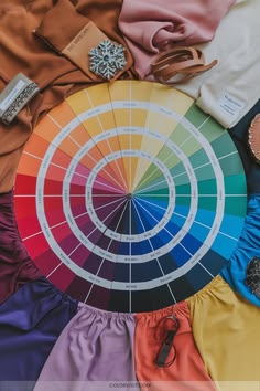
The classic color wheel breaks the spectrum into 12 hues across three tiers:
- Primary colors — red, blue, yellow. These are the base colors; nothing else combines to make them, and in their raw form they’re the loudest thing in the room.
- Secondary colors — green, orange, purple. Each is just two primaries mixed evenly (red + yellow = orange, blue + yellow = green, blue + red = purple).
- Tertiary colors — red-orange, yellow-orange, yellow-green, blue-green, blue-purple, red-purple. These sit between a primary and its neighboring secondary.
Where menswear actually lives: tints, shades, and tones
The mistake most guys make when they first look at a color wheel is picturing pure, saturated pigment — but nobody’s outfit should look like it came out of a crayon box. Bright red trousers next to an equally bright green jacket reads as a costume, not a look. Real menswear lives almost entirely in three modified versions of each hue:
- Tints (hue + white) — softer and lighter. Red turns into pale pink, blue into baby blue, purple into lavender. These work well in shirting and warm-weather layering.
- Shades (hue + black) — deeper and heavier. Red becomes burgundy or oxblood, blue becomes navy, green deepens into forest or hunter. This is where most suiting and outerwear lives.
- Tones (hue + gray) — muted and desaturated. Yellow becomes mustard, orange becomes rust or terracotta, green shifts toward olive or sage. Tones are the easiest to wear because they blend into neutrals without effort.
2. Four Color Schemes You Can Actually Build Outfits Around
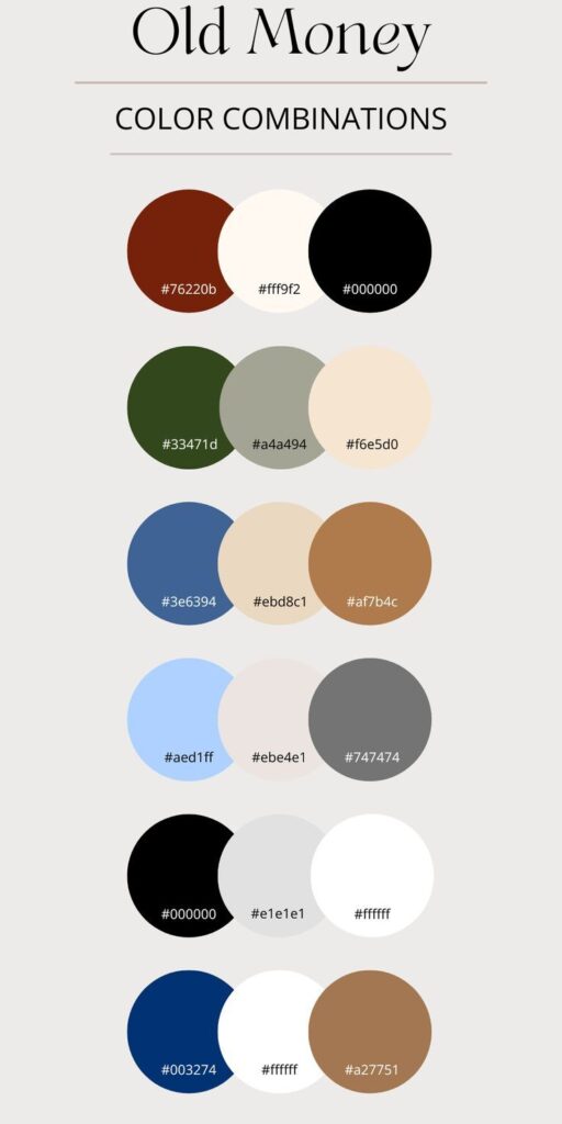
Once you understand how colors relate to each other geometrically on the wheel, you can dial contrast up or down depending on the occasion — conservative for the office, louder for a Saturday.
A. Monochromatic — one color, different depths
This is about staying in a single color family and letting tints, shades, and tones do the work of creating variation. Done well, it looks tailored and deliberate rather than boring.
The trick is to avoid matching identical shades across different fabrics — unless it’s literally a two-piece suit. You need contrast in lightness or texture, or the whole outfit goes flat.
Casual:
- Raw indigo jeans (deep shade)
- Sky blue oxford shirt (light tint)
- Navy suede overshirt (mid-tone, added texture)
- Indigo canvas sneakers
Formal:
- Charcoal flannel trousers
- Light heather gray merino turtleneck
- Slate gray topcoat
- Dark silver pocket square
B. Analogous — neighbors on the wheel
Analogous colors sit next to each other — blue, blue-green, green, or tan, olive, rust. Because they share undertones, they naturally feel cohesive without any real effort on your part.
The move here is to let one color dominate and use the neighboring hue as a supporting layer or accent, not an equal partner.
Smart casual:
- Dark navy chinos (dominant)
- Chambray shirt (supporting blue)
- Olive waxed cotton field jacket (adjacent layer)
- Dark brown Chelsea boots
Elevated tailoring:
- Forest green tweed sports coat
- Light blue poplin shirt
- Navy knit silk tie
- Mid-gray wool trousers
C. Complementary — opposites for real contrast
Blue and orange. Red and green. Yellow and purple. These sit directly across from each other on the wheel, and pairing them creates the most visual energy of any scheme.
The catch: never use them in equal amounts at full saturation, or you’ll look like a mascot. Ground the outfit in a deep shade of one color and bring in the opposite only as a muted accent.
Business:
- Midnight navy suit (deep blue base)
- White spread-collar shirt (neutral buffer)
- Rust or burnt orange tie (muted complement)
- Cognac dress shoes
Weekend:
- Olive drab cargo trousers
- Cream waffle-knit crewneck
- Oxblood leather jacket (muted red complement)
- White low-top sneakers
D. Triadic — three points, evenly spaced
Think blue/red/yellow, or green/purple/orange — three hues spaced evenly around the wheel. It’s the most vibrant of the four schemes, but also the easiest to overdo.
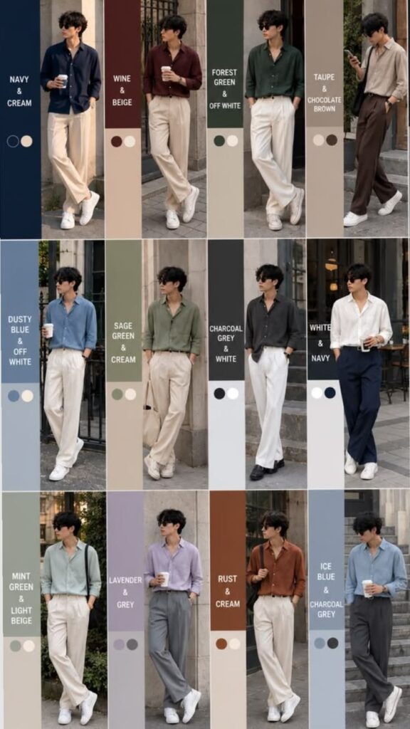
Anchor it with a neutral base, and keep two of the three colors heavily muted or pushed down to small details — socks, a watch strap, a pattern.
Casual:
- Raw dark denim (blue)
- Burgundy sweatshirt (red shade)
- Mustard cap or camel overcoat (yellow tone)
- Off-white sneakers
Dressed up:
- Navy blazer (blue)
- Plum or lavender shirt (red/purple)
- Camel trousers (yellow-derived neutral)
- Chocolate suede loafers
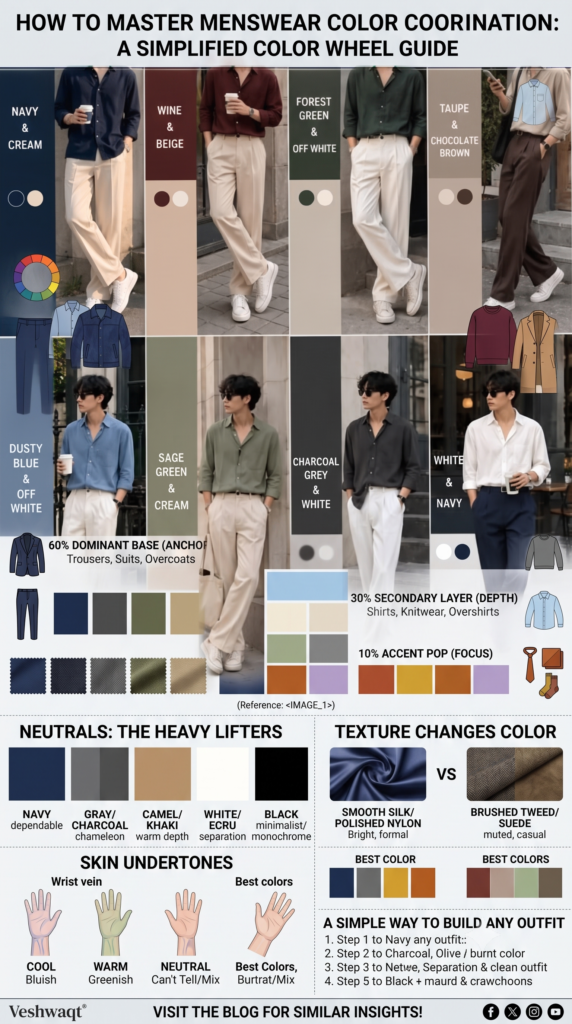
3. The 60-30-10 Rule for Proportion
Even a great color pairing falls apart if the proportions are off. Interior designers use the 60-30-10 rule for a reason, and it maps directly onto an outfit.
| Component | Share | Where it goes | What it does | Good options |
|---|---|---|---|---|
| Dominant base | 60% | Trousers, suits, overcoats | Anchors the whole outfit | Navy, charcoal, olive, khaki, chocolate brown |
| Secondary layer | 30% | Shirts, knitwear, overshirts | Adds depth and a second color relationship | Sky blue, cream, ecru, heather gray, sage |
| Accent | 10% | Ties, pocket squares, socks, scarves | Gives the eye somewhere to land | Rust, mustard, burnt amber, emerald, lavender |
4. Why Neutrals Do So Much Heavy Lifting
Neutrals don’t technically sit on the color wheel, but they’re what makes everything else work. They calm down saturated colors, give the eye room to breathe, and bridge combinations that would otherwise feel jarring.
- Navy is the most dependable anchor in a man’s wardrobe — it works with earth tones, grays, whites, and pretty much any leather.
- Gray and charcoal are true chameleons. No warm or cool bias means they sit comfortably next to almost anything.
- Camel, tan, and khaki carry warm, yellow-orange undertones and bring an organic depth to navy, olive, and cream.
- White, off-white, and ecru are your separation pieces — an ecru knit softens a look far better than stark white ever will.
- Black works best in monochrome, minimalist, or evening looks. It can overpower softer earth tones, so keep it paired with slate, charcoal, white, or jewel tones like emerald and camel.
5. Texture Changes How Color Reads
Color isn’t just about the hue — the surface of the fabric changes how light bounces off it, which changes how the color actually looks to the eye.
A bright color woven into tweed or brushed suede reads as muted and easy to wear, while the same color in silk or polished nylon reads sharper and more formal.
Your leather has to match the temperature of the outfit too:
- Cool outfits (charcoal, navy, gray, slate) → black, oxblood, or deep slate brown leather.
- Warm outfits (olive, camel, khaki, rust) → medium brown, tan, cognac, or chocolate suede.
6. Dressing for Your Skin Undertone
Technically, you can wear any color if you pick the right shade of it — but matching colors to your skin’s undertone near your face makes the whole look sharper.
Quickest way to check: look at the veins on the inside of your wrist in daylight.
- Bluish or purple → cool undertone.
- Greenish → warm undertone.
- Can’t tell / looks blue-green → neutral undertone.
7. Four Full Outfits, Start to Finish
- Business formal (subtle complementary): Charcoal two-piece suit as the neutral base, an ice-blue dress shirt as the cool tint, and a deep plum tie as the warm accent. Oxblood oxfords ground it with a rich, dark leather.
- Smart casual (analogous): Tapered navy trousers under a sage green crewneck over a white undershirt. Cognac suede loafers and a matching watch strap tie it off.
- Casual weekend (earthy monochromatic): Off-white straight-leg denim with an oatmeal waffle-knit sweater, a rust watch cap, and tobacco suede Chelsea boots.
- Rugged workwear (triadic): Raw selvedge denim, an olive canvas chore jacket, and an ochre bandana or brass hardware for the yellow accent, finished with amber leather work boots.
A Simple Way to Build Any Outfit
- Start with your 60%. Pick your trousers or outer layer in a dependable neutral — navy, gray, khaki, or olive.
- Pick your scheme. Low-contrast and easy (monochromatic or analogous), or higher-energy (complementary or triadic).
- Mute your hues. Keep saturated primaries and secondaries out of large pieces — save them for 10% accents, and let tones and shades do the rest.
- Match your leather. Warm brown for warm outfits, black or cool brown for cool ones.
None of this is about following strict rules — it’s a framework you can reuse. Once the relationships between hue, shade, and proportion click, putting an outfit together stops being a guessing game.
Enjoyed this post? Check out more articles on the blog for similar insights!
Follow Veshwaqt on Instagram!